
How to Get Vibrant Colors with DTF: The Professional Creator’s Guide
Your digital screen lied to you. You designed a neon masterpiece, but your heat press delivered a muddy, faded disappointment that belongs in the scrap bin. It's a frustrating reality for many creators; however, learning how to get vibrant colors with DTF isn't about luck. It's about mastering a high-fidelity industrial workflow. You're tired of wasting expensive blanks on transfers that lose their punch after one wash. We understand that frustration. Transfers by MoreTranz has helped over 14,000 creators bridge the gap between digital brilliance and physical impact.
In this guide, you'll master the technical secrets to achieving industrial-grade color vibrancy and professional-tier output. We'll show you how to hit those neon peaks and deep, rich blacks that command attention. We'll break down why your RGB workflow matters, how 300 DPI resolution sets the foundation, and why upgrading to TrueColor® MAX (9-Color) DTF technology is the ultimate competitive differentiator for serious brands who demand perfection. Stop settling for dull results and start executing with total confidence.
Key Takeaways
- Enforce the 300 DPI resolution standard to eliminate pixelation and establish the foundation for professional-grade transfer clarity.
- Master the technical secrets of how to get vibrant colors with DTF by optimizing your digital design workflow for professional-tier output.
- Upgrade to TrueColor® MAX (9-Color) DTF products to shatter the CMYK barrier and achieve expanded gamut results standard (5-Color) systems cannot reach.
- Utilize professional vector conversion and background removal services to eliminate "white halos" and ensure a sharp, high-impact finish.
- Calibrate heat and pressure settings to maximize ink curing and ensure your high-impact apparel survives the industrial wash cycle.
Optimizing Artwork Resolution for High-Impact DTF Prints
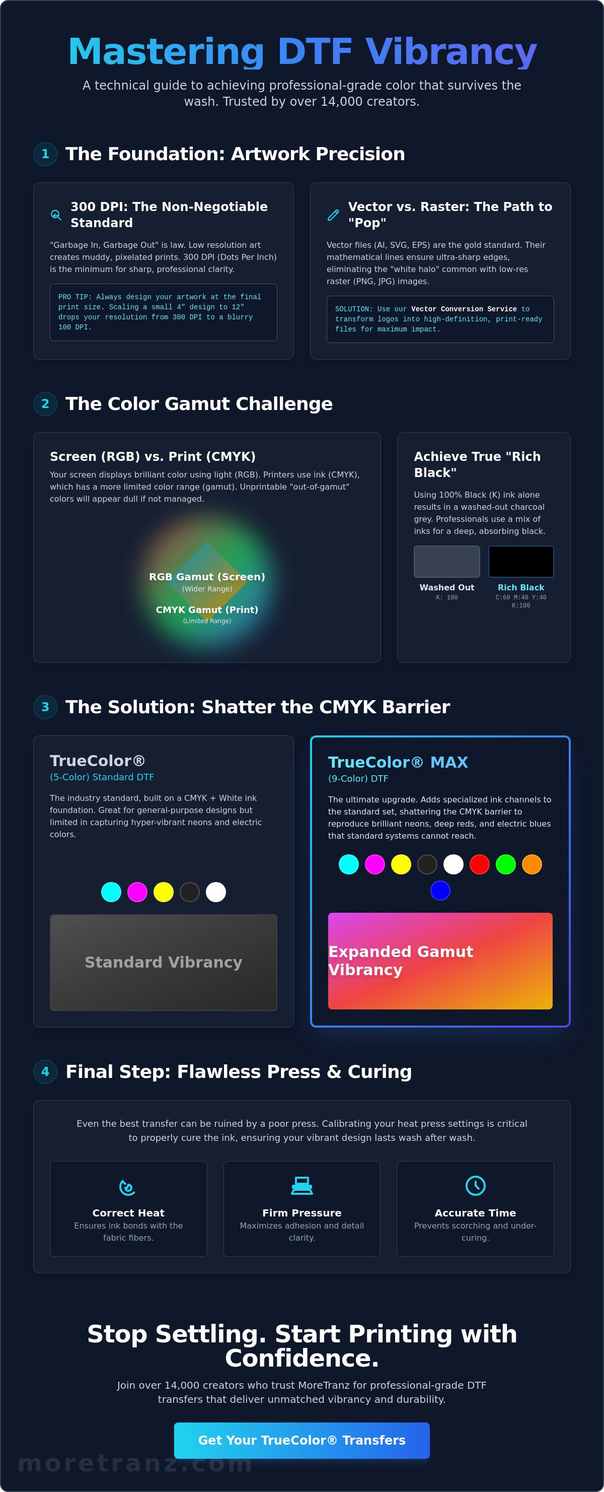
High-performance output begins at the source. The "Garbage In, Garbage Out" rule is the absolute law of digital garment decoration. If your source file is low-resolution, no amount of high-end ink can save the final product. Understanding how to get vibrant colors with DTF starts with technical precision at the pixel level. Scaling up a low-quality image doesn't add detail; it only stretches existing pixels, leading to blurred edges and diluted color saturation that looks amateur on a finished garment.
To better understand how file quality impacts your final print, watch this helpful video:
The 300 DPI Standard: Non-Negotiable Precision
Precision is the currency of the professional creator. The Direct-to-film (DTF) printing process relies on a specific density of information to translate digital light into physical ink. 300 DPI is the non-negotiable minimum for professional-grade transfers. Low resolution causes "ghosting," where the printer struggles to define edges. Always design your artwork at the actual final print size to maintain maximum saturation. If you design at four inches and scale to twelve, your pixel density drops, and your colors will appear muddy rather than sharp. In the context of professional printing, DPI refers to the number of individual ink droplets the printer places within a linear inch to recreate your digital image.
Vector vs. Raster: Why Clean Lines Matter
While high-res PNGs are common, vector files are the gold standard for high-impact results. Raster artifacts often muddy your mid-tones and create a dull finish. Clean, mathematical lines in vector art allow colors to "pop" with intense clarity against dark fabrics. This eliminates the "white halo" effect where the underbase peeks through jagged edges. For creators who need to elevate existing logos, our Vector Conversion Service is the professional secret to achieving that high-definition look. Transfers by MoreTranz has optimized this workflow for over 14,000 creators who refuse to settle for "good enough" and demand TrueColor® excellence every time. When you start with a clean vector, you give the ink the best possible surface to bond with, ensuring your strategy for how to get vibrant colors with DTF succeeds from the first step.
Mastering Color Profiles: Why RGB to CMYK Conversion Dictates Vibrancy
Your monitor radiates light in RGB, creating a digital brilliance that physical ink often struggles to match. This digital-to-physical gap is the graveyard of many great designs. Understanding Mastering Color Profiles: Why RGB to CMYK Conversion Dictates Vibrancy is the first step in learning how to get vibrant colors with DTF. If you blindly design in RGB without a conversion strategy, your final prints will lack the impact your brand requires. Precision matters here.
Designing in the Right Color Space
Set your Photoshop or Illustrator workspace to sRGB, but always utilize the "Proof Colors" feature to see the CMYK reality. Watch for "out-of-gamut" warnings. These small icons signal that your chosen neon or electric blue is physically unprintable with standard inks. To overcome these limitations, professional creators often switch to the TrueColor® MAX (9-Color) DTF product. This system adds specialized ink channels to capture the vibrance standard (5-Color) systems cannot reach. It's the difference between a flat image and a design that demands attention.
Don't ignore the importance of "Rich Black." Using only 100% black ink results in a washed-out charcoal gray. A professional rich black uses a technical blend of Cyan, Magenta, and Yellow under the Black channel (such as 60, 40, 40, 100) to create a deep, light-absorbing finish. This depth provides the necessary contrast to make your other colors appear more intense. Transfers by MoreTranz has refined these profiles for over 14,000 creators to ensure every transfer meets a high-performance standard.
The Role of White Ink Management
Your white underbase is the foundation. It acts as a high-opacity primer that prevents the garment color from bleeding through your design. If your white ink density is too low, your colors will look dull and translucent. If it's too high, you risk ink migration and a heavy, rubbery feel. Achieving the perfect balance is essential for how to get vibrant colors with DTF. The final lock is the adhesive powder. High-quality powder ensures that the white base stays crisp and the colors remain durable through repeated industrial wash cycles. Test our TrueColor® technology on your own equipment by ordering a MoreTranz Sample Pack today.
TrueColor® MAX: Dominating the Gamut with 9-Color DTF Technology
Standard 4-color CMYK printing has a technical ceiling. It's a physical limit that prevents you from reaching the most electric parts of the visible spectrum. If you're struggling with how to get vibrant colors with DTF that actually match the brilliance of your digital monitor, you have to break the CMYK barrier. TrueColor® MAX does exactly that. By utilizing a proprietary 9-color ink system, we've expanded the printable gamut far beyond the industry standard. This isn't just a marginal improvement. It's a total overhaul of what's possible in digital garment decoration. We've eliminated the muddy mid-tones and flat highlights that plague standard transfers.
TrueColor® (5-Color) vs. TrueColor® MAX (9-Color)
Standard TrueColor® (5-Color) Standard DTF products are the reliable workhorses of the industry. They provide bold, high-opacity results for everyday branding and primary color logos. However, complex artwork with subtle gradients or hyper-vivid oranges and greens requires more technical firepower. TrueColor® MAX (9-Color) DTF technology adds specialized ink channels, including RGB and Orange, to bridge the gap between digital light and physical pigment. This expanded gamut allows for hyper-realistic skin tones and hits neon-adjacent peaks that standard CMYK systems simply ignore. When your brand identity relies on a specific, high-impact hue, the 9-color advantage is your only path to professional-tier output.
Industrial Precision for Every Order
Vibrancy is useless without absolute consistency. MoreTranz serves over 14,000 creators who require industrial-grade reliability on every single gang sheet. We utilize high-performance print heads that maintain exact droplet placement even during high-volume production cycles. This ensures that the first transfer on your sheet looks identical to the last. While other vendors might sacrifice color accuracy for speed, we've built a frictionless workflow that delivers both. You get the technological dominance of a massive manufacturing plant with the accessibility of a "No Minimums" service model. This level of precision is the ultimate secret to how to get vibrant colors with DTF without the risk of faded or inconsistent output. We don't just sell transfers; we provide a professional-grade toolkit for creators who are serious about their business objectives. Every order is a commitment to visual intensity and physical resilience.
Professional Pre-Production: Vector Conversion and Background Precision
The "Artwork to Print" workflow is the most overlooked phase of digital garment decoration. Most creators focus on the printer or the ink, but the file itself is the actual blueprint for success. If your digital foundation is flawed, your physical output will fail. Background removal is the hidden key to achieving a vibrant "pop." When a file contains semi-transparent pixels, stray noise, or unrefined edges, the printer generates a white underbase for those imperfections. This creates a muddy visual field that dilutes the intensity of your primary design. Professional pre-production ensures every droplet of ink serves a specific purpose. It's a critical component of learning how to get vibrant colors with DTF.
Vector paths provide the mathematical precision required for industrial-grade results. Unlike raster images that rely on pixels, vector paths define exact boundaries. These paths act as a guide for the adhesive application. They ensure the heat press applies pressure directly to the ink rather than the surrounding film. This targeted pressure is vital for deep color saturation. When ink is forced into the garment fibers with high-performance precision, the colors appear richer and remain more resilient through the wash. MoreTranz has refined this high-fidelity workflow for over 14,000 creators who demand immediate, professional-tier results.
The Halo Effect: How to Kill Vibrancy with Poor Edges
A white outline, commonly known as a "halo," is the hallmark of amateur file preparation. This technical failure occurs when the white underbase is perfectly aligned with the top color layer. During the heat press process, the white ink can slightly shift or expand. Professional masking involves "choking" the white underbase. This means shrinking the white layer by a fraction of a millimeter. This specific interaction between the white underbase and the artwork edge ensures the white stays hidden. It allows your TrueColor® or TrueColor® MAX (9-Color) DTF output to stand out with absolute clarity on any fabric color. If your artwork is too complex for manual cleaning, utilizing the MoreTranz Background Removal Service ensures your edges are flawless from the start.
Specialty Finishes: Adding Texture to Color
Vibrancy isn't limited to standard pigments. You can elevate your brand impact by combining color intensity with physical texture. Glitter DTF Transfers offer a multi-dimensional sparkle that catches light without losing the underlying color saturation. For a high-impact sequin look, Spangle Transfers provide maximum light reflection for high-performance apparel. These specialty options prove that how to get vibrant colors with DTF is about choosing the right tool for the objective. Even hard surfaces benefit from this technology. Our UV DTF Decals maintain intense color fidelity on tumblers and industrial equipment, ensuring your brand remains consistent across all touchpoints.
Ready to execute your next project with total confidence? Browse our full range of high-performance transfers and experience the TrueColor® difference today.
Executing the Press: Heat and Pressure Settings for Maximum Pop
The final stage of the workflow is where many creators snatch defeat from the jaws of victory. You've optimized your artwork and utilized high-fidelity inks, but a poor press will kill your vibrancy instantly. Mastering the mechanics of your heat press is the final hurdle in learning how to get vibrant colors with DTF. Temperature and ink curing share a critical relationship. If your press is too cool, the adhesive won't liquefy enough to bond. If it's too hot, you risk scorching the film or gasifying the ink, which leads to a dull, faded appearance. Precision is your only path to industrial-grade results.
Pressure is the most overlooked factor in color saturation. Many creators rely on "medium" pressure, but vibrant, durable transfers require a heavy, consistent force. This physical pressure drives the ink and adhesive deep into the garment fibers. It creates a unified surface that reflects light more efficiently, making your colors appear more intense. Without adequate pressure, the transfer sits on top of the fabric like a sticker, leading to a "plastic" feel and a muted visual impact. Execute with total confidence by ensuring your equipment is calibrated for high-performance output.
The Perfect Press Checklist
Don't trust your heat press display blindly. Use an infrared thermometer to verify that the heating element delivers accurate temperature across the entire platen. Cold spots are the primary cause of inconsistent color and premature peeling. Follow these technical requirements for a professional finish:
- Calibrate Temperature: Ensure your press hits the exact degree required for your specific fabric type.
- The Heavy Pressure Rule: Set your press so it requires significant effort to lock down. This ensures the ink bonds deep into the fibers.
- Post-Press Strategy: Always perform a second press. Use parchment paper for a soft, matte "retail" finish or a Teflon sheet if you prefer a high-gloss, high-impact look.
Testing Your Results
Once the press is complete, perform the "Stretch Test." A high-quality TrueColor® (5-Color) Standard DTF product should expand with the fabric and return to its original shape without cracking or losing color depth. If the color appears to "break" during the stretch, your curing temperature or pressure was likely insufficient. This post-press step is essential for how to get vibrant colors with DTF that don't crack or fade after the first wash.
The best way to calibrate your specific equipment is to use the MoreTranz Sample Pack. It allows you to test our TrueColor® and TrueColor® MAX (9-Color) DTF technology without risking your own blanks. Join the 14,000 creators who have moved beyond "good enough" to dominate their markets with visual intensity and physical resilience. Stop guessing and start executing with the professional-grade toolkit your brand deserves.
Dominate the Market with Industrial-Grade Vibrancy
Mastering the direct-to-film workflow isn't about luck; it's the result of technical precision across every stage of production. You've learned that 300 DPI resolution, optimized color profiles, and professional vector conversion are the non-negotiable pillars of success. By combining these pre-production steps with high-performance heat press settings, you've unlocked the secret of how to get vibrant colors with DTF every time you hit the press. Precision in the digital phase ensures resilience in the physical phase.
MoreTranz is the expert facilitator for your business growth. We provide the professional-grade toolkit needed to outperform standard market alternatives. With our proprietary TrueColor® MAX (9-Color) DTF technology and no minimum orders on custom gang sheets, you have the power to scale without limits. Join the 14,000 creators who trust our industrial reliability to deliver high-impact results with every order. It's time to stop settling for dull output and start executing with total confidence.
Upgrade to TrueColor® MAX and Experience 9-Color Vibrancy
Your brand deserves the visual intensity only technological dominance can provide. Start building your high-impact apparel today.
Frequently Asked Questions
How do I make my DTF colors more vibrant when printing?
Access industrial-grade vibrancy by utilizing TrueColor® MAX (9-Color) DTF technology. This expanded gamut system hits electric hues that standard CMYK printers simply cannot reproduce. You must also ensure your white underbase is thick enough to act as a high-opacity primer. This prevents the garment's base color from bleeding through and dulling your top layer. Start with 300 DPI files to ensure every ink droplet contributes to a high-impact finish.
What is the best color setting for DTF transfers?
Design in the sRGB color space but utilize CMYK proofing to monitor your printable gamut. This allows you to maintain the widest range of digital color data while ensuring your physical output remains realistic. MoreTranz uses proprietary ICC profiles to ensure absolute consistency for over 14,000 creators. This technical balance prevents disappointment during the transition from screen to fabric. It's the only way to maintain brand integrity across high-volume production cycles.
Why do my DTF prints look dull after pressing?
Dullness after pressing typically indicates insufficient pressure or inaccurate temperature settings. If your heat press pressure is too light, the ink won't bond deep into the garment fibers, resulting in a surface-level print that lacks visual depth. Always verify your equipment with an infrared thermometer to ensure industrial-grade precision. A second press with parchment paper can also help lock in the saturation and provide that professional, high-impact retail finish your customers expect.
Should I use RGB or CMYK for DTF design?
Design in the sRGB color space to preserve the maximum amount of color information before your RIP software handles the conversion. This is a critical step for how to get vibrant colors with DTF because it prevents premature color clipping in your design software. The printer's specialized processing will translate those digital light values into physical pigment more accurately than any manual CMYK conversion. Preserve your data to maximize your final output.
Can I get neon colors with TrueColor® MAX?
Yes, the TrueColor® MAX (9-Color) DTF system hits neon-adjacent peaks and electric hues that standard 5-color systems cannot reach. By adding specialized ink channels like Orange and RGB, we expand the printable spectrum significantly. This allows you to achieve the hyper-vivid results your high-impact apparel requires for maximum market dominance. It's the ultimate competitive differentiator for serious creators who refuse to settle for the flat colors of standard CMYK printing.
What resolution is needed for vibrant DTF prints?
300 DPI at the final print size is the non-negotiable industry standard for professional output. Anything lower results in pixelation and blurred edges, which kills the perceived vibrancy and clarity of your design. High-resolution files ensure that every ink droplet is placed with surgical precision for a sharp, high-definition finish. Don't waste expensive blanks on low-res art; start with a high-fidelity foundation to ensure your colors "pop" with total confidence.
How does background removal affect color vibrancy?
Professional background removal eliminates stray pixels and semi-transparent "noise" that can trigger an unwanted white underbase. By creating clean, sharp edges, you prevent the "white halo" effect and ensure your colors stand out with absolute clarity against the fabric. This pre-production step is a technical secret to how to get vibrant colors with DTF. Clean files allow the printer to focus ink density exactly where it belongs, maximizing the visual impact of your design.
Why are my blacks looking gray on my DTF transfers?
Gray-looking blacks are typically the result of using 100% Black (K) ink without a technical "Rich Black" formula. To achieve a deep, light-absorbing finish, you must utilize a CMYK blend that layers Cyan, Magenta, and Yellow under the Black channel. This high-density approach provides the necessary contrast to make your surrounding colors appear more intense. MoreTranz has optimized these rich black profiles for over 14,000 creators who demand professional-tier results on every gang sheet.